Web Design in 2016 Trends to Expect
Looking forward to what we expect some of the web design trends to be this year in 2016. Web design in 2016, will use a lot of concepts that came to the forefront in the previous year of 2015.
There will be some new concepts being integrated into websites too. Some old trends will be adapted and moulded with new ones which will ultimately push website design forward again this year. The popularity of responsive web design continues to surge for obvious reasons. This concept we at Primal Space feel is an essential feature of all website designs. It’s essential to ensure that every website designed, is functional in all devices a user views that site in.
Web Design in 2016
Hidden Menus
The use of hidden menus is becoming more and more common in modern website designs. The hidden menu is often also referred to as a “hamburger menu”. This menu concept began life with the purpose of being used in mobile designs for smaller screens. You’ll see that our very own website here at Primal Space features this function if you are viewing the website on your mobile phone or on a device with a small screen. When you hover over the hidden menu or tap on it, the full menu will pop out.
Video Background
Websites that feature a video in the background of their homepage are becoming more common. The popular concept is becoming easier to implement into websites. With the increase in the speed of broadband connections, these video websites are able to load flawlessly in any device. Popular well-known website featuring a video background in its homepage design is the Airbnb site. The video in the header section of this site loops for a period of time while the user decides where to navigate to next. Each time you visit the site, you’ll be shown a different video to enhance your experience a little.

The image is taken from www.airbnb.co.uk
The design we feel is successful because the theme of each video is linked to the theme of the site. So, for example, a video might show a family in a dining setting. Or a guest waking up from a comfortable nights sleep. For a website with a video background to be successful, the video needs to be relevant and serve a purpose. Making a website look good should be a secondary concept for us after it’s function. While it is important to ensure that every website looks beautiful. The purpose of a webpage must never be forgotten and ultimately should be the main priority of its design. A video background should never break the function of a page for the user. It should be just that and be in the background.
Clever Use of Image Layering
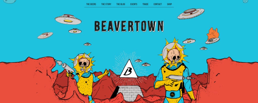
A more complex concept we’ve seen recently in a number of website designs that we love is the use of graphics or images in a page to create a layered scene. The layers load well with a parallax design as the user scrolls up and down the page. Beavertown Brewery in London is a company that has achieved this well.

Image from www.beavertownbrewery.co.uk
The only downside to this concept that we can see, is that with the use of a large number of images, the page can take a while to load initially. The load on the browser is quite evident. So perhaps more is required to improve the overall load time of websites using this concept. Also, the parallax scroll is a little rigid. It’s not as fluid to move up and down the page as some other concepts can be.
Single Page Websites
The concept of a single page website is not a new one. Single page website designs have been around for a few years, but are becoming more and more popular. So a single page website may have a menu showing at the top of the page like a normal site. But the page links in the menu link to the various section of this 1 homepage of the website.
Full Page Scrolling
We have designed a number of home pages that feature this simple concept. It generally involves a design that features full-page slides. When the user rolls the wheel on their mouse or clicks an arrow to go down the page, they are navigated to the next full slide down the page. So the page moves in full sections only.
Further Development of Responsive Design
Web design in 2016 will obviously see again an increase in the design of responsive websites. These are websites that intuitively load dynamically in any device that your site user browses on. The concept of responsive web design has been around for a number of years. The adoption of dynamic and responsive website design increased massively in 2015 though, and will likely continue to do so even more in 2016. All of the websites we have designed here at Primal Space are responsive. Every site we build and design loads fluidly in all devices it’s opened on. Try changing your browser size while viewing this page, for example, to test how this concept works. You’ll see the page adjusts to fit perfectly within your browser window size always.
White Space Simple Design
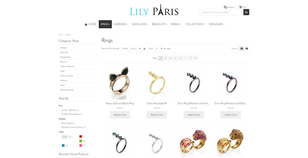
Again this is not a new concept, for example, 1 of the most famous uses of this concept is the Apple website. This concept was present on their website over 5 years ago and has always remained on it constantly while it goes through its frequent updates. The pages always have white backgrounds. This clear-background allows any images or videos on top to display very prominently to the user. We have always loved this concept of websites being clutter free and simple in design. A recent e-commerce website we have designed for Lily Paris includes this simplistic concept throughout the site.

Image from www.lily-paris.co.uk
The criteria for the Lily Paris Jewellery website build was to create a minimal modern design, with an emphasis on simplicity. This allowed the colourful product content of the website to take a focal point in each page. You’ll see from the screenshot above that a lot of the sections of this product page appear to be floating. Achieved through clever use of CSS and without giving sections backgrounds. Gentle thin borders are given where necessary. Certain sections have no border at all to give the feel of them floating in the page. The website though still managed to keep the majority of the traditional expectations of an e-commerce website. I.e. everything is where it should be or is easy to locate. Main menu in the top centre area. The search bar in the top right-hand corner. Large product image in centre left section of the page. With product description and more information below. The design has proved to be incredibly popular and has been getting some great feedback since the site was launched in 2015.
Contact Forms Spanning Full Page Width
Linking in with a site having a simple, clean design, the use of a website page having a contact form taking up the full width of the page is becoming more common. The theory behind being to give the contact form more focus within the page. The form is what the owner of the website wants you to use on that page, so it should be as focal as possible. Every other piece of text or image would just be a distraction to the user away from the contact form. This concept linked with some simple CSS animation works really well. So parts of the contact form moving or being highlighted in some way to catch the users eye. Ultimately the main purpose of having the contact form on the page is to get the user to complete it. From a design point of view, the contact form needs to be as enticing as possible. While remaining simple and quick to complete. The secret to a successful contact form we feel is to only request details that are absolutely essential for the user. People just want to be able to quickly submit their details. If it is going to take the user more than 30 seconds or so to complete the form, you may be asking for too much information from them.
Advancements of Animations
Some more complex website designs use animated graphics on the page to put the message needed across to users.
What are your favourite website design trends? Let us know. We’d love to hear about your ideas.
